From John Cena wearing headbands on his arm to Cristiano Ronaldo making the number seven, long sleeve and slicked hair look his own, the greatest sporting icons always have their trademark look.
Barcelona hold the blue and red stripes as their own. Not Crystal Palace, contrary to popular belief.
La Blaugrana have been one of football’s most exciting and successful teams in history, in doing so making their classic red and blue striped kits a favourite among football fans.
Here’s our rank of the top 10 greatest Barcelona home kits ever.
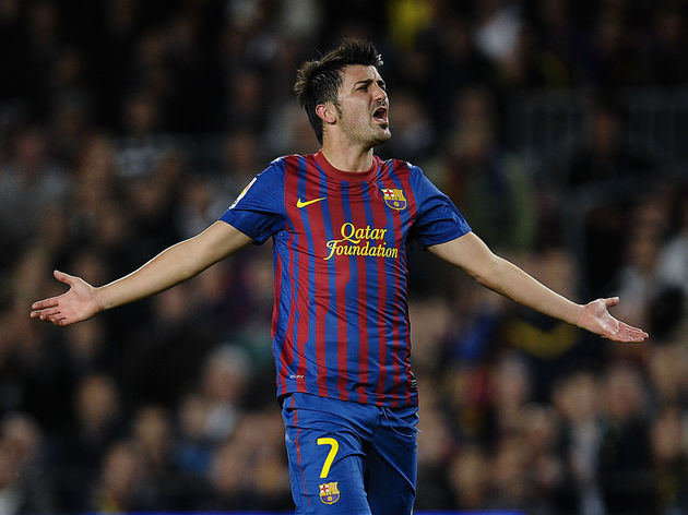
10. Nike’s Asymmetry (2011 – 2012)

In a more audacious effort from their long time kit suppliers, Barcelona took to the pitch on a modern update of the traditional blue and red stripes in Pep Guardiola’s final season in charge.
The kit had blue sleeves, and the red vertical stripes were thinner than usual, but changed thickness half way down to provide a dynamic look. It was completed with classic yellow accents and the Qatar Foundation logo, which had replaced Unicef as Barça’s front sponsor.
9. Vintage (1982 – 1989)
If you had to imagine a Barcelona kit in its rawest form, this would be it.
The staple design of red and blue vertical stripes was so good, because it was so simple. Produced by Meyba, the kit had a traditional blue collar, and minimal design on the sleeves. That’s it.
They also kept the kit for almost a decade, which tells you just how perfect it was.
8. Half & Half (2008 – 2009)

The first treble in the club’s history was won while wearing a striking kit, that is perhaps under-appreciated.
For the 2008/09 campaign, Barcelona ditched the traditional stripes and instead used the clubs colours in a half and half effort. Finished off with a yellow Nike swoosh and Unicef sponsor, this kit was simply stunning. Images of Lionel Messi celebrating in the Champions League final with his boot in his hand still haunts Manchester United fans to this day.
7. Back to Basics (2010 – 2011)

Another kit from the incredible Guardiola era, the 2010/11 season was a major success.
Lionel Messi bagged 53 goals in all competitions as Barça donned a much more traditional, striped design. What made it pop, however, were the yellow accents; the yellow collar and sleeve cuffs were striking, and added another dimension to the timeless design. It is believed that the 2020/21 home kit will be similar in style.
6. Centenary (1999 – 2000)

The 2008/09 half and half design wasn’t actually the first of its kind; Barcelona celebrated their centenary with an incredible half and half shirt in the 1999/00 season.
Dark blue sleeves separated themselves from the main body of the shirt, which was half blue half red. The badge was displayed proudly in the centre of the chest, with the stitched in dates of the 100 years on either side of it. Finished off with a collar, the shirt looked vintage but entirely new at the same time.
5. Nike’s Debut (1998 – 1999)

The 1998/99 season was Nike’s first as official kit supplier to Barcelona. They had big shoes to fill by replacing Kappa, and delivered with an incredible first effort.
Simple yet effective, a strategy that they followed for a number of years, the 1998/99 shirt looked much more modern than previous seasons. The crest was centred, and the kit was predominantly red, with two large blue stripes running down either side of the crest.
4. Kappa (1992 – 1995)
Kappa dominated the 90s when it came to football kits, with many of theirs becoming popular as retro football shirts boom.
Their work as Barcelona kit supplier was just as impressive. The shirt brought in ahead of the 1992/93 season was a belter; the classic red and blue stripes surrounded the main body of the shirt, which was given another dimension as Kappa embedded the word ‘Barça’ all around. The shirt was finished off with a classy blue collar, red sleeves and the iconic Kappa tape branding down each shoulder.
3. Total 90 (2005 – 2006)

Barcelona’s 2005/06 home kit would prove to be their last without a shirt sponsor, and we’re thankful it wasn’t marred by one.
Nike went back to basics with this one, opting for a high up yellow Nike swoosh, along with some small yellow accents at the bottom to ever so slightly break up a shirt that was purely red and blue stripes.
2. Johan Cruyff Era (1973 – 1974)
The reason Nike ended up producing such stunning, simple kits was because of this one.
Dark red and dark blue stripes all around, and nothing more. Perfect.
1. The Latest Treble (2014 – 2015)

After a poor, gradient effort in the 2012/13 season, Nike dialled it down a touch with the adventurous designs for the Barcelona home kit, and rightly so.
The 2013/14 shirt was lovely, but the 2014/15 effort went one better. The thick, red and blue stripes were restored and finished off with blue sleeves, a yellow Nike swoosh and a white Qatar logo to make things pop.
They wrapped up another treble in this campaign, as they won La Liga, the Champions League and the Copa del Rey in fine fashion.
The best detail, however, is the collar. On the front of the shirt, Nike inserted a small, triangular cut out with a burst of Catalan colours, which completely brought the shirt alive. Simple, yet incredibly well done, and it encapsulated everything you need to know about Barça into one.
